netobserv
Next
Informal doc gathering ideas about potential next steps. It’s a brainstorming place, not a roadmap.
Traffic Flows
Visualization
SanKey charts
An horizontal representation of flows between nodes[1]. It’s a pretty way to quickly appreciate both traffic distribution and volumetry
E.g. https://www.d3-graph-gallery.com/sankey.html Also, Elastiflow shows a nice usage of sankey charts.
[1] “Node” here means graph node, not kube node.
Chord diagrams
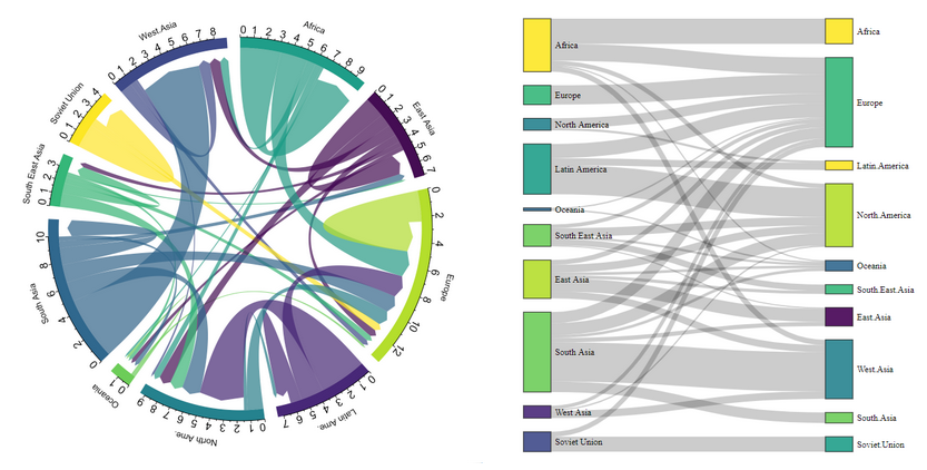
They are similar to sankey charts but with a round shape. Instead of an East/West distinction, in/out traffic can be represented with different color tones.
E.g. https://www.d3-graph-gallery.com/chord.html
Another example, same data visualized through chord or sankey:

Correlation with other kind of data
Data coming from netflows could be correlated with other kind of data (using same source/dest and close time), such as Cluster Metrics (e.g. high CPU / memory usage on pod X at a given time), Kube events (e.g. pod restarted, or deployment was scaled up/down), Logs (e.g. errors spotted in logs on pod X at a given time) or Distributed Tracing.
While the immediate goal would be to improve the troubleshooting experience for users, it could also potentially open a research field for trend analysis, anticipation / failures prediction.
Alerting
Investigate alerting capabilities of Loki, and whether or not it would make more sense to use Prometheus for this matter (see below: metrics generation).
Example of alerts: network saturation? and the opposite, network abnormally quiet.
Metrics generation
The flow collector (or OVS?) could also produce metrics out of the flow data (E.g. counters of bytes / packets / dropped packets etc.). eBPF will bring that, too.
Edge
Smart sampling / analysis of flows at the edge could help generate more accurate data in high volumetry scenarios. See pktvisor: https://github.com/ns1labs/pktvisor.
Datapath flows in OVS
See also: https://issues.redhat.com/browse/NETOBSERV-53
“Datapath flows” here refers to the datapath inside an OVS node, it’s not the same as netflows which refers to runtime traffic.
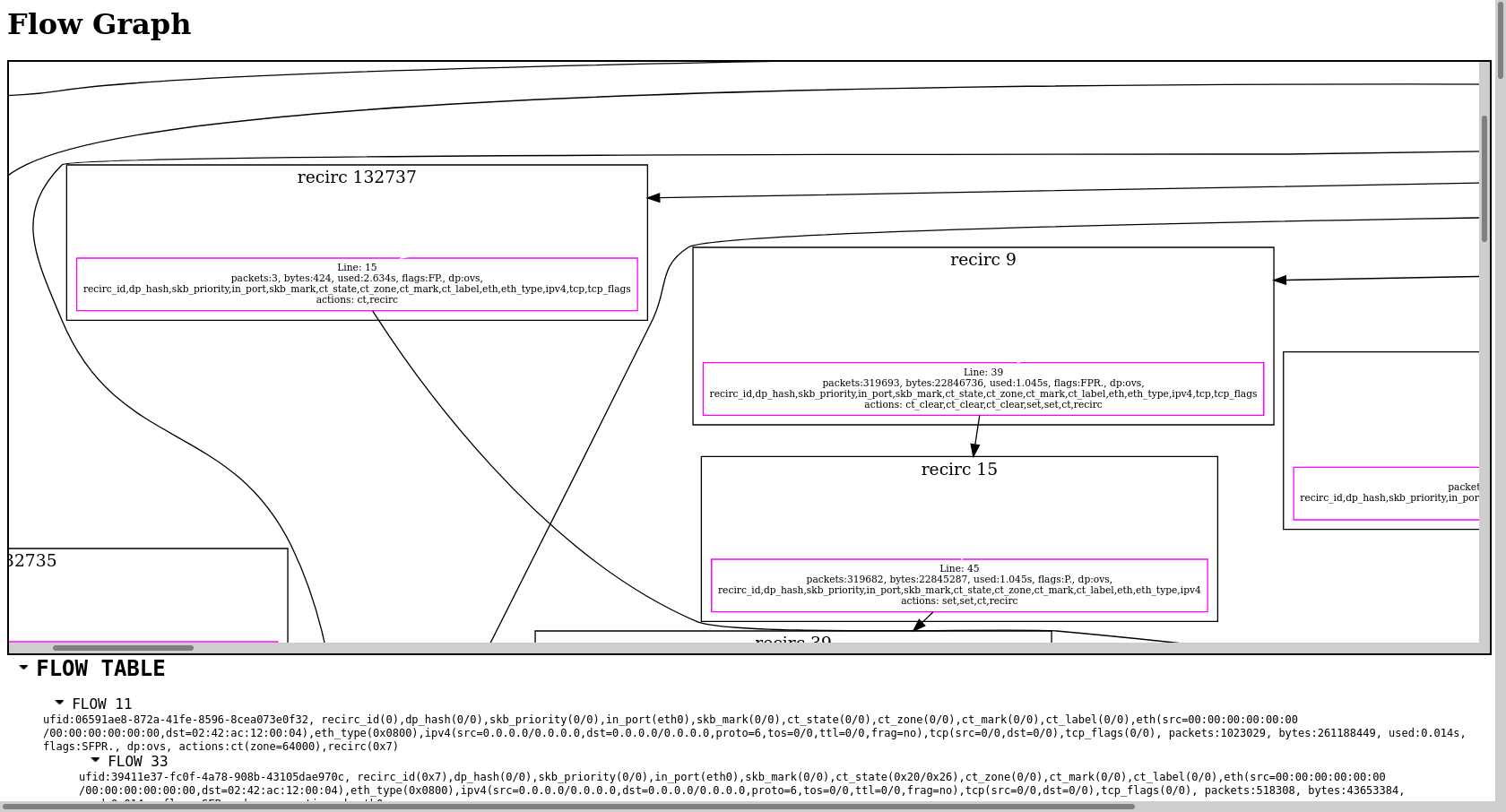
Showing a graph of datapath flows could be a great help for network admins while troubleshooting network.
Here’s a (cropped) screenshot of such a flow:

Network policies
Visualization
Find ways to better visualize:
- A single network policy
- Network policies involved for a given pod / workload / namespace
Testing
Connectivity checks to test that two pods can communicate, or that they cannot.
Integration of such tests with a CI tool?